[Or go right to the latest OBZ page]
From 'Higher Type' to Isotype? - Nietzsche and the Roots of Modernist Graphic Design
We know Nietzsche got his start not as a philosopher but as a children's book author.
Still, what if that isn’t true?
Or rather, what if it is equally true that Nietzsche got his start neither as a philosopher nor as a children's book author but as a bold pioneer in the stylized—stylish!—visual presentation of information?
We think of Isotype as the brainchild of philosopher Otto Neurath, with artist Gerd Arnst responsible for executing designs, and Marie Neurath acting as ‘transformer’ between, deploying her considerable talents as artist and scientist on a co-equal, collaborative basis.
What a testament to the sensibility of 'Red Vienna', during the interwar years. Vienna! With its radical progressivism, hotbed intellectualism and peculiarly severe taste in art, craft and design!
But, again, what if the truth is it all started much earlier?
Pictures don't lie. See below a gallery graphical extracts from Nietzsche's original design portfolio, which he intended to see through, not in book form, but instead as proliferating iconographic signage to be erected by roadsides and in public spaces across Europe.
As well, this picture language could be conveniently employed in the effective design of public health bulletins to hang in every doctor's office! To say nothing of colourful posters suitable for school settings at all education levels!
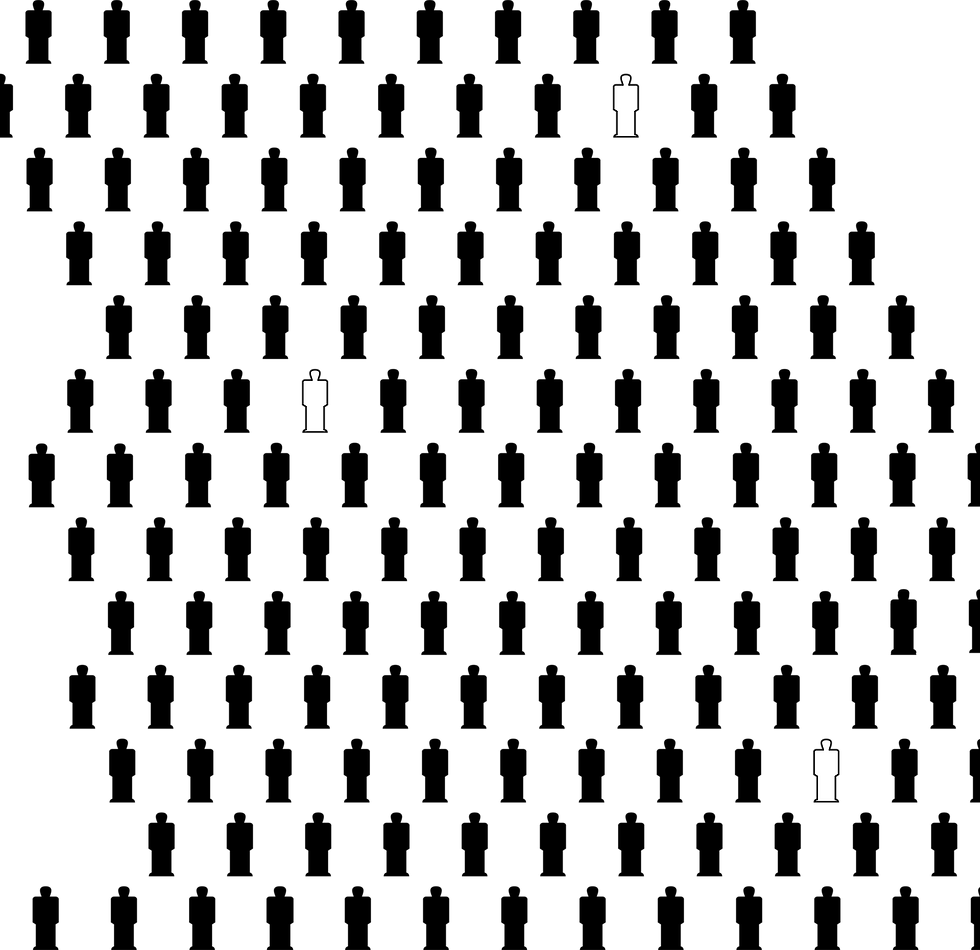
Nietzsche's key design insight: complex, esoteric ideas, appreciable only by the few—perhaps only by the One!—can be conveyed via simple, conventionalised iconography, suitable for delivering simple, readily understandable ideas to the many.
Naturally, as this insight made no sense, no one had any notion what Nietzsche was on about and the project languished on the drafting table. Eventually it occurred to him maybe he could write a book.
But the story doesn't end there!
Decades later Otto Neurath has the philosophical foresight and acumen to see that, though Nietzsche's abortive ‘Isohighertype’ project was an unquestionable failure, yet this simple picture language—open to all, hence unsuitable as a private, esoteric code for a spiritualized elite of isolated ‘higher types’—could be repurposed, social democratically, as a simple picture language, open to all!
At a stroke, Isohighertype became—Isotype!
And the rest is design history!
And yet these pre-historic remains, sampled below, can still be unearthed in a few archives today. (Even the original cover for Thus Spoke Zarathustra, also pictured below—so strikingly modernist!—is accountable, design-wise, only in light of the book’s pre-history!)
And the history of philosophy? This archival rediscovery must reconfigure how we regard not just the birth of visual modernism but the fraught relationship between ‘analytic’ philosophy—of which Otto Neurath is a Vienna Circle exponent—and ‘continental’ philosophy—of which Nietzsche is a bold Ur-Vater
.
Perhaps we can look forward to a future day when analytic and continental philosophers are able to bridge their differences by exchanging simple depictions of iconic human figures, and so the design circle shall be complete!
NOTE: All this is parody! It's not real! To be clear. Also, to my knowledge, my sampling of pre-war Isotype work is legally in the clear, not just as transformative parody but due to no existing/valid copyright title/transfer after W.W. II. It's pretty important that people not make frivolous copyright claims to iconic modernist designs that should no longer be under copyright. Fair is fair.
(If you want to buy a sticker or something, go here! Honestly, I only sell this stuff because it's funny to sell it, not because I make much money.)


